// for festivals

Websites for film festivals.

A festival site has problems a general-purpose web designer hasn’t met: it changes identity every year, it can’t miss a public date, and the people editing it next year haven’t been trained. I’ve built one — here’s what that actually took.

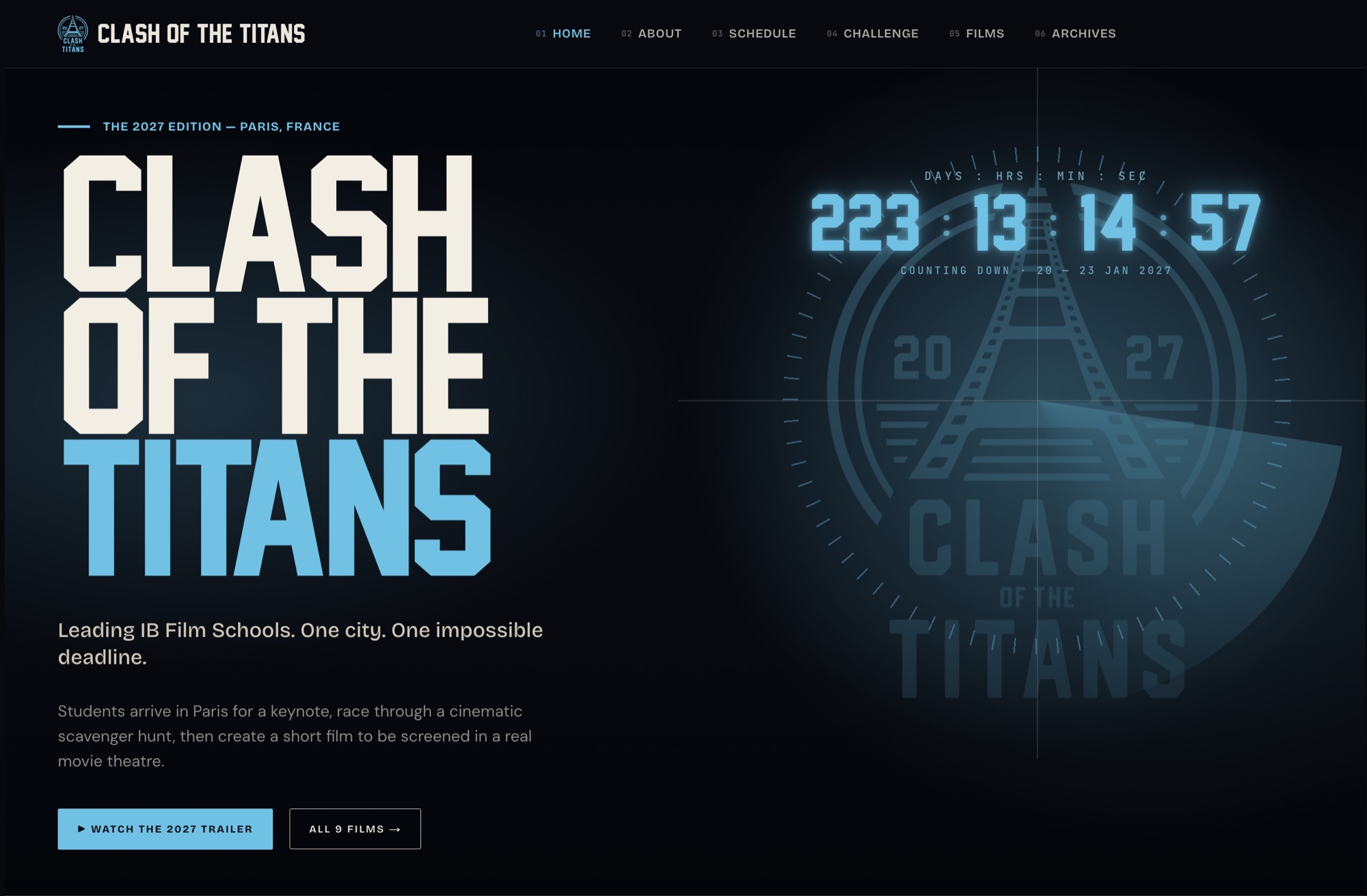
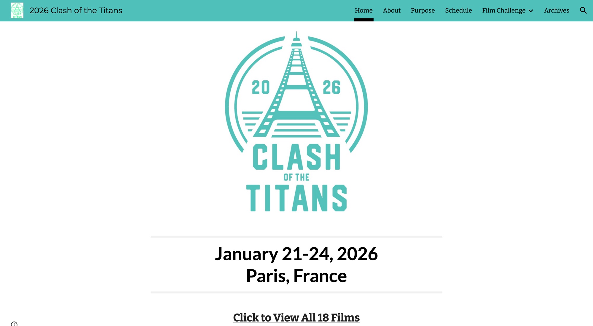
// Clash of the Titans, Paris — before and after. drag to compare.

Clash of the Titans — the rebuilt festival siteBeforeBEFOREAFTER
37 → 85
mobile speed score, more than doubled
69 → 98
desktop speed score
0.51 → 0
layout shift, eliminated
100
perfect accessibility & SEO

Google Lighthouse · mobile & desktop · the new site vs. the old Google Sites it replaced · June 2026

The site has to change identity every year

New edition, new poster, new colour, new dates. On a template that means a redesign conversation every single year. On the festival site I built, the whole brand runs off one CSS colour token — the organizers re-skin it themselves in about a minute, with no developer and no rebuild.

The date is public and immovable

A festival can't slip. Opening night is opening night, and a site that lands late is worse than useless. That's why the scope, price and two-week timeline are fixed up front rather than discovered along the way — and why anything that would genuinely expand scope becomes an explicit conversation instead of a silent overrun.

Whoever edits it next year wasn't trained this year

Festival teams turn over. The site gets edited furiously for six weeks, abandoned for ten months, then edited again by a partly different set of people. So the CMS isn't optimised to be powerful — it's optimised so a volunteer can open it in October, having last touched it in March, and not be confused.

Photos arrive faster than anyone can upload them

During the event, the person with the photos is at the venue on their phone between screenings. Nobody is logging into an admin panel. So organizers drop photos into the shared Drive folder they already use, and they appear in the homepage gallery — no upload step, nothing to learn.

Audiences decide on a phone, in a hurry

Programme, times, venue, tickets — usually checked on mobile, often on bad wifi. The old Google Sites page scored 37 on mobile and visibly shifted around as it loaded, which costs trust at exactly the moment someone is deciding whether to come.

Our old site had all the information but no structure or visual impact — it was hard for visitors to grasp the event's value. The new site completely changed that: intuitive navigation, clearer messaging, and a modern, professional design that reflects the ambition of the event. It makes it far easier for participants, sponsors, and visitors to engage — a website that doesn't just inform, but inspires confidence and excitement.

Erick Pessôa
Organizer · Clash of the Titans

One festival, not twenty

I’ve built one festival site, and I’m not going to dress that up as a specialism with a decade behind it. What it means in practice is that the specific problems above are ones I’ve actually hit and solved, rather than ones I’d be meeting for the first time on your deadline. If you want a studio with ten festivals on the wall, that’s a fair thing to want.

Currently on Google Sites, like they were? See the side-by-side comparison →

Let’s get your new site live by September 10.

// free 20-min scoping call · no obligation · reply within 1 business day